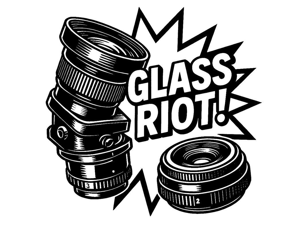
Glass Riot!
An exploration of speculative optics and analog-era industrial design
This poster series began as a graphic experiment: an attempt to evoke the language, typography and surface logic of 1970s camera and film packaging through fictional brands and hardware. The result is a collection of imagined photographic systems that blends product design, typographic play and speculative nostalgia.
Wildkör T. F. 58mm f/0,93 Biofraktal
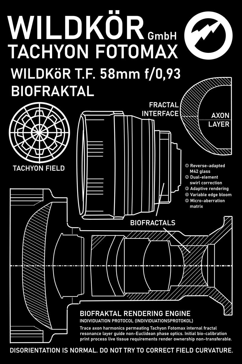
This fictional lens design blends ultra-fast portrait glass aesthetics with exaggerated European industrial naming. The layout draws inspiration from East German and Scandinavian manuals, with intentionally ambiguous labeling and off-kilter tech jargon. The typography aims to feel both precise and unplaceable. Functional at first glance, the Biofraktal becomes increasingly strange the longer you look.
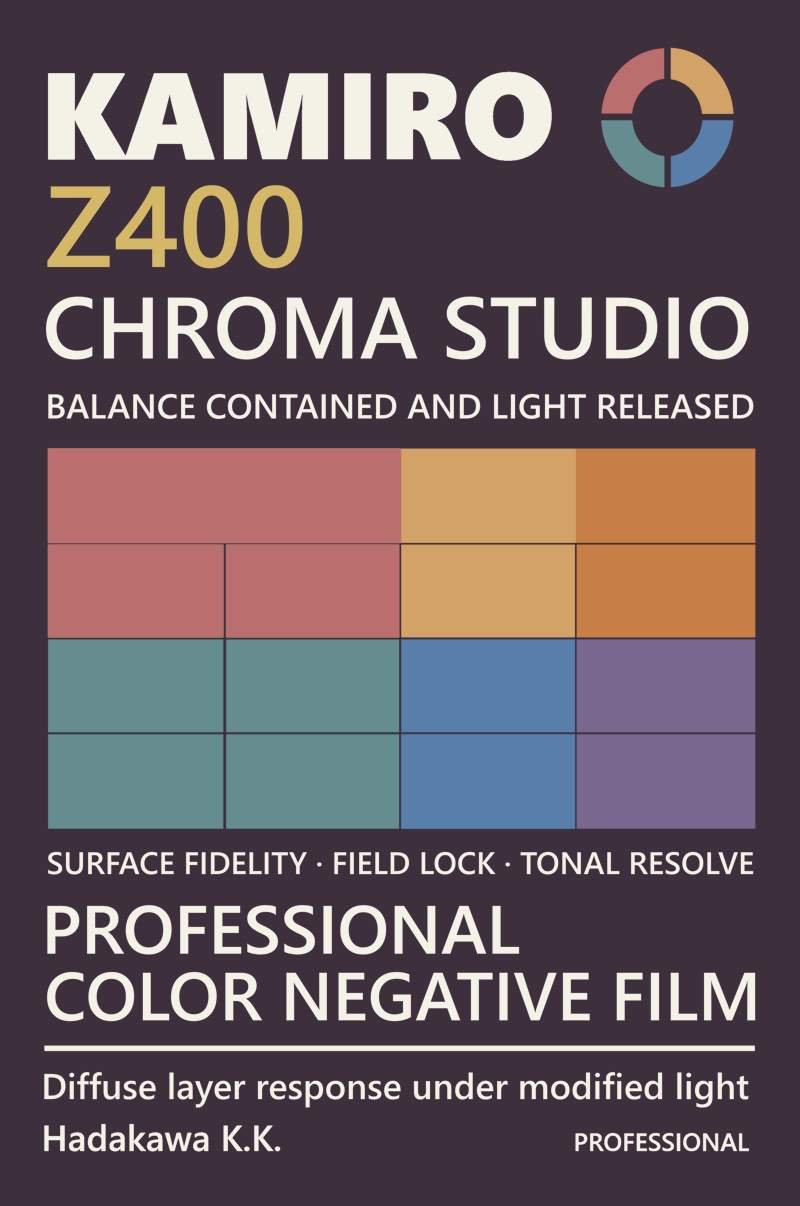
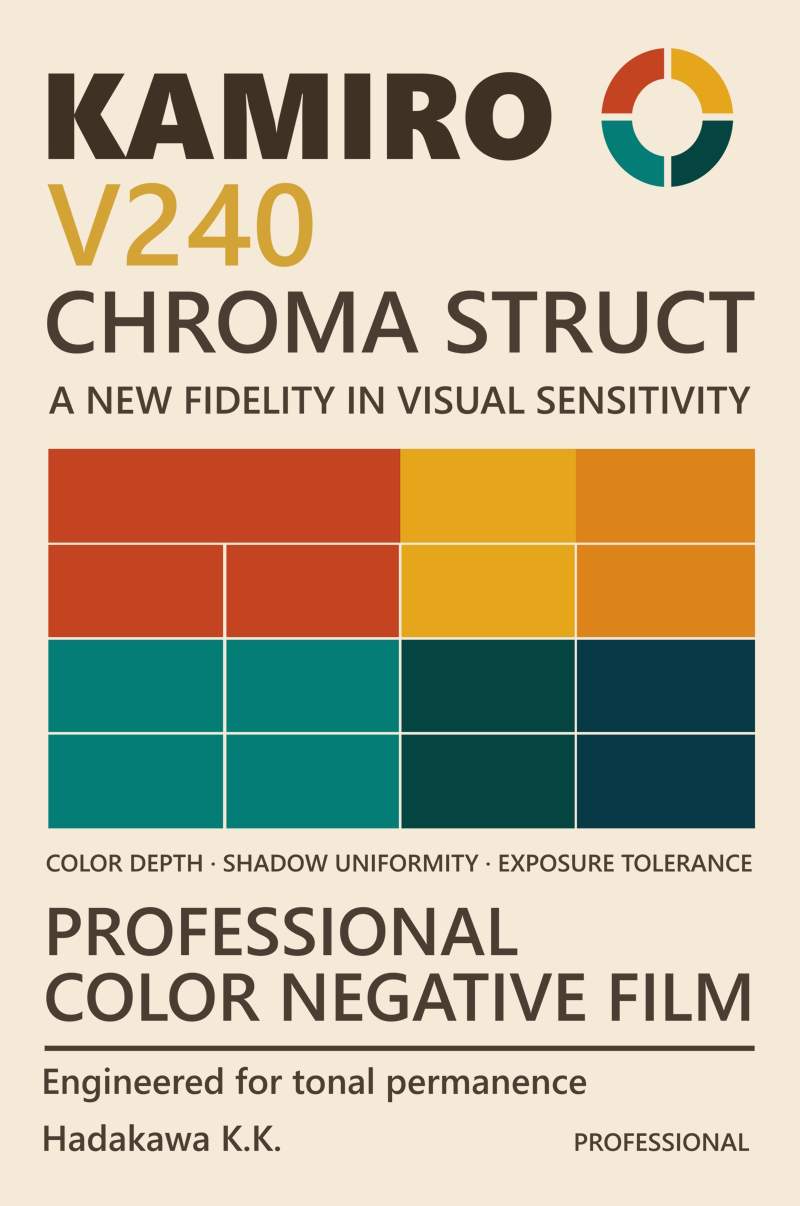
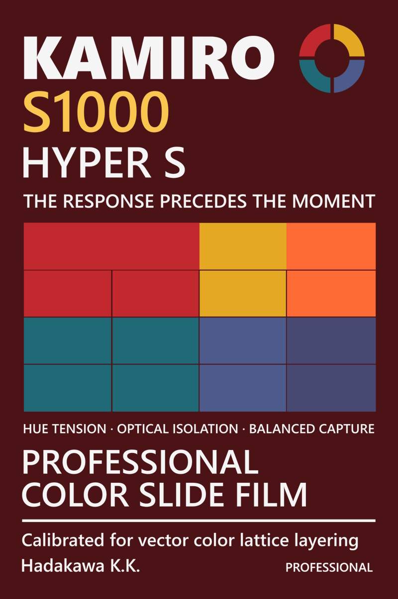
Kamiro Photofilm Systems
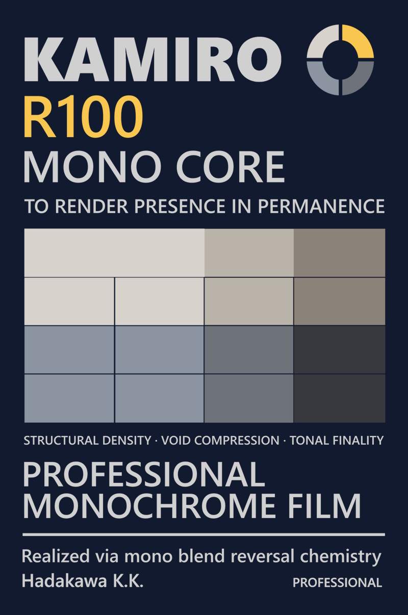
Light reversed into presence: each frame a complete gesture in silver.
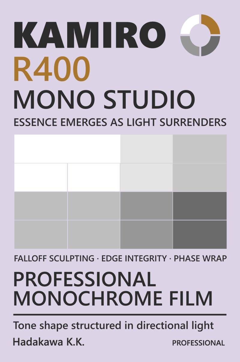
Monochrome tuned for faces: the measured fall of light across form.
A tonal environment for human subjects: where color sings and light listens.
A balanced field of grain and gradient: the everyday in its most lucid form.
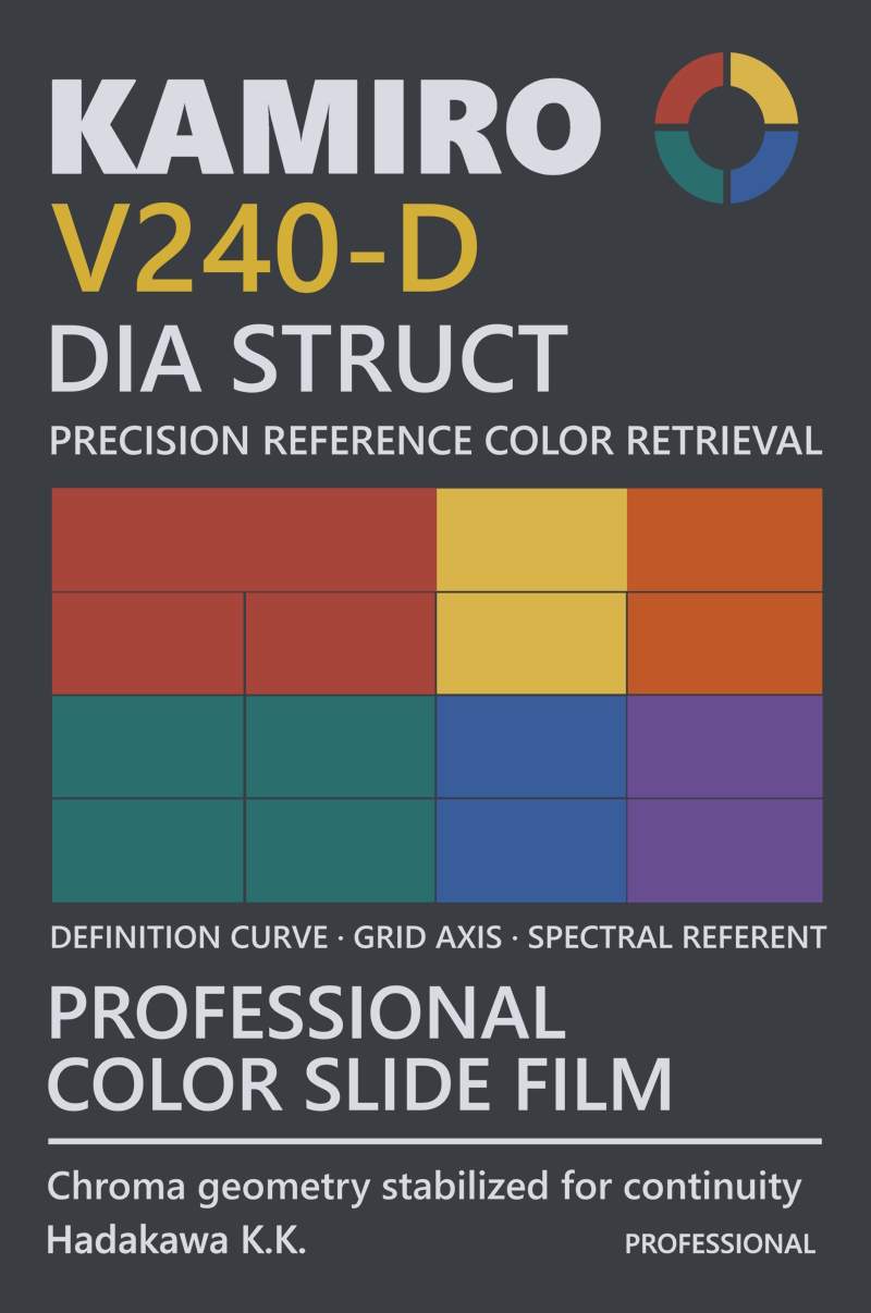
Transparency with intent: each hue locked in place and measured by light.
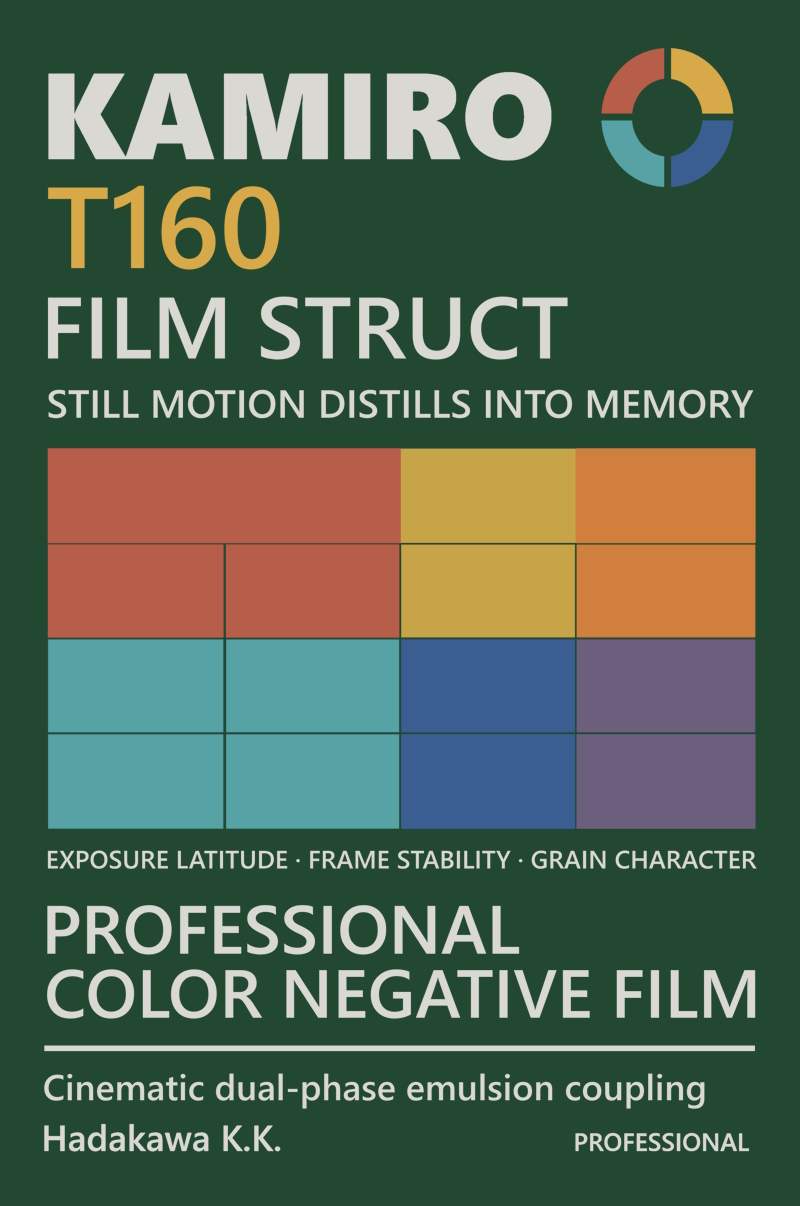
Layered emotion in dual emulsion: memory half-formed, half-fading.
Chromatic intensity at the edge of perception: pushing color past its limit.
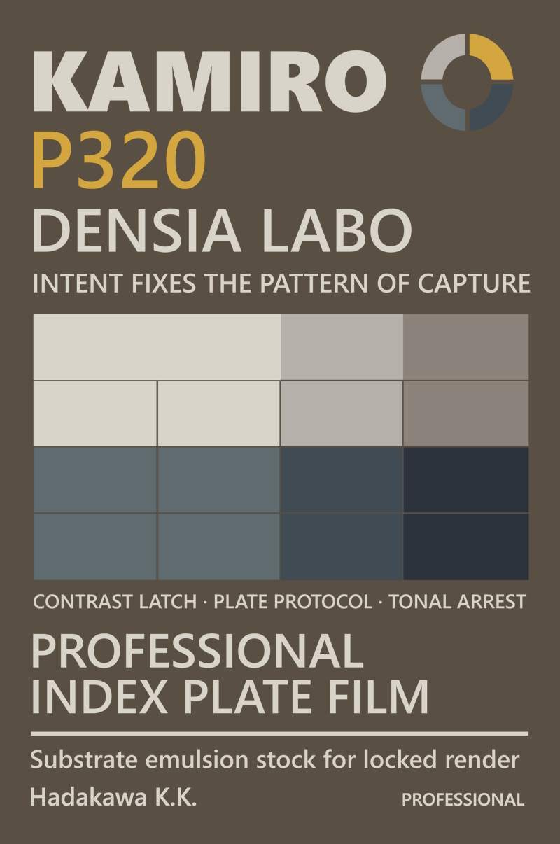
Structure captured in static fidelity: diagrammatic clarity rendered in high-density monochrome.
This companion set of posters under the Kamiro identity explores the idea of modular film and imaging systems. Each piece reflects a different component in a speculative analog imaging ecosystem, grounded in clean grid layouts and offset-era print textures.
Design elements reference Japanese camera packaging and datasheets from the late '70s to early '80s, with a focus on matte paper tones, slightly offset color swatches and dense but orderly information hierarchies. The goal was to create something that feels just barely unreal, where a familiar layout gives way to a descriptive logic that gradually defies explanation.